Site redesign
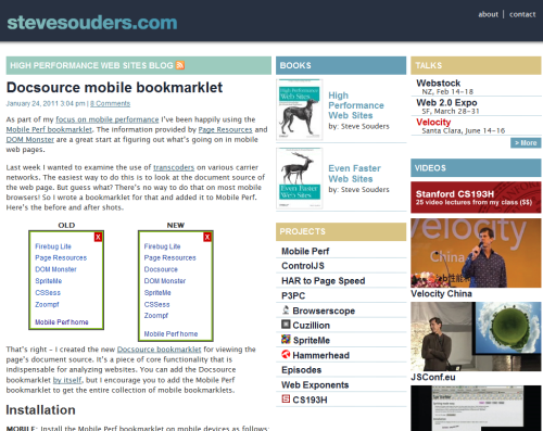
The list of things I’m good at does not include web design. As a result, this was how my website looked for the past few years:

Over the holidays I was lucky enough to get connected with Emily Matthews from NOLA Marketing who came up with a new design for stevesouders.com:

Around the same time I met Jennifer Stuart who develops, among other things, WordPress themes. She took the design and developed a custom theme for my blog from which I lifted parts to integrate back into the main site.
Shout outs to Emily and Jennifer – thanks for making my site look so much better!
Jos Hirth | 06-Feb-11 at 5:46 pm | Permalink |
Heh. Sorta funny how this post about the new layout broke the layout of the home page. The images are slightly too wide. They are 500px wide, but the maximum width is 456px (better: 436px).
Darren Slatten | 06-Feb-11 at 9:04 pm | Permalink |
Hi Steve,
I’ve learned quite a bit about web performance optimization from reading your blog, and I have a great deal of respect for you and for the things you’ve accomplished.
With that being said, I have to admit…this “redesign” of yours has left me scratching my head. As far as I can tell, you took one step forward and ten steps back.
The pipe separating your top navigation links is actually a 1px X 15px all-white image? Table-based layout…really? A header background image that’s 30 times wider than it needs to be?
Maybe I’m missing something, but the difference between the old and new designs is trivial in appearance, yet you’ve managed to pick up at least 3 additional HTTP requests in the process.
On the other hand, maybe this is a good opportunity for me to give back to the Godfather of WPO. In that case, here’s a gift for you. I’ve rewritten a handful of your WP theme’s style declarations in a way that maintains the current look and feel, yet reduces the HTTP requests by 2. Feel free to paste these styles over your current declarations for the
#headerand#topnav liselectors:http://pastebin.com/raw.php?i=ZngssXPJ
Cheers,
Darren
Dave Hulbert | 07-Feb-11 at 1:00 am | Permalink |
Steve, the HTML and /wp-content/themes/SteveSouders/style.css could be minified a bit more to save a few 100 bytes :-)
André Scholten | 07-Feb-11 at 3:55 am | Permalink |
The also has some elements than can easily be removed: edituri, wlwmanifest, index, prev, next elements.
But I like the new design more than the old one. It’s cleaner and easier to read.
André Scholten | 07-Feb-11 at 3:56 am | Permalink |
Is the captcha also new? It says “won” for 1 and “ate” for 8? I can imagine not everyone understands that.
Steve Souders | 07-Feb-11 at 7:32 am | Permalink |
Thanks for all the performance suggestions. I’m going to run this for awhile to establish a baseline then measure performance improvements one-by-one.
@Andre: I used to have numeric equations and still had bots. These phonetic equations work better. I think they’re more fun, too.
Jennifer | 09-Feb-11 at 1:16 pm | Permalink |
Thanks for the shout out Steve. :D Just to respond to the question about the pipe being an image vs. maybe just a | (?) – I think that is far from being a “table based layout”. :) I prefer to use an image (placed via CSS) in cases like that so screen readers do not read the “|” since it has nothing to do with the navigation itself and is for aesthetics only.
Jennifer | 09-Feb-11 at 1:54 pm | Permalink |
Actually Darren’s solution to using a solid color with a shadow (rendered via CSS) is good. But I’d be interested to know what the difference in performance is between loading an image in for the | vs. using data:image.gif… From what I understand – the browser needs to recreate that “image” every time. So possible short-term (single page load) benefit – but not good long-term (multiple page load)?
Steve Souders | 09-Feb-11 at 2:55 pm | Permalink |
And to be clear, all the table layout is code I wrote for the front page. Jennifer wrote the blog layout which doesn’t use any tables.
Umair Jabbar | 11-Feb-11 at 6:48 am | Permalink |
Hello Steve,
Your site looks much much better. This simple and clean new layout is very good.
Dennis Hall | 29-Mar-11 at 4:28 pm | Permalink |
Couldn’t resist adding to this vertical image discussion. How about a border? You’ve already got a class of “last” to work with. #topnav li {border-right:1px soild #fff;} #topnav .last {border:0;} The line would be 1px taller, but if you needed to, you could fix that too. FYI, first time here, so no particular feelings about the “new” site. However, congrats on the update!