HTTP Archive: URL list, Flash trends
Last week I announced the launch of the HTTP Archive. The feedback has been very positive. I’ve already heard from a handful of performance gurus who have downloaded the data and done additional analyses. This was a major goal of the project and I’m excited to see it happening.
I made a few changes to HTTP Archive that I wanted to share in this blog post.
First, there’s a potential for apples-to-oranges comparisons because the list of URLs “crawled” by HTTP Archive changes from run to run due to errors and changes in the “top N” sorting of sources like Alexa and Fortune 500. When comparing two runs it’s unclear if differences are caused from a change in the sample set or actual changes in Internet behavior. This was exemplified by this tweet from @orionlogic:
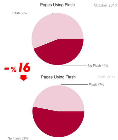
Website flash usage dropped %16 since 6 months http://t.co/XI7IWvc (via httparchive.org + @souders ) #noflash
The link contains two pie charts from HTTP Archive:
The issue is that the number of URLs grew from ~1000 in October 2010 to ~17,000 in April 2011. Those additional 16,000 websites have different behavior when it comes to using Flash. If we compare Nov 15 2010 to Mar 29 2011, both of which use ~17,000 URLs, the change is only 2%.
I made some changes to mitigate this issue.
- The first three runs that were done with only 1000 URLs are now hidden in the UI. The data is still available.
- Similar confusion can happen when viewing trending charts. The fix there is to use the “intersection” set of URLs across all runs. I added a note next to the “choose URLs” pick list to point out the benefit of choosing “intersection”. I moved the plot of “URLs Analyzed” to the top so it’s more apparent when the number of URLs changes from run to run.
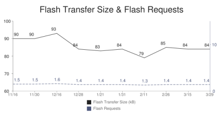
On another note, Nicole Sullivan suggested I add a trending chart for transfer size and number of requests for Flash, in addition to the existing charts for HTML, JavaScript, CSS, and Images. The hypothesis was this might explain the increase in image sizes that I presented in my previous post – perhaps Flash was on the decline being replaced by HD images. The chart shows a slight decline in the size and number of Flash files, but not enough to explain the 61 kB increase in image transfer size.
I made several other fixes that are less visible. Several people have submitted requests for new stats. I’ll keep knocking those off and blogging about them.


Josh Fraser | 05-Apr-11 at 11:51 pm | Permalink |
Love what you’re doing and thanks for the update and explanation on the data.
One minor typo. I think ~17,00 should be ~17,000.
Sorin | 06-Apr-11 at 4:26 am | Permalink |
OK, so what is the value of this chart, if you admit that you compare apples to oranges?
Way not be fare and add a chart that compare the same amount of URLs?
What method do you use to detect flash presence?
I understand the need for traffic, but to draw conclusions after comparing irrelevant data is unprofessional.
Steve Souders | 06-Apr-11 at 8:10 am | Permalink |
@Josh: Thanks for pointing out the typo.
@Sorin: You misunderstand. The charts are from the tweet. The links I provided point to a comparison with the same URLs, and the 2% difference is, again, from a comparison with the same URLs.
orionlogic | 08-Apr-11 at 3:32 am | Permalink |
It was my fault not to look at the # links between months. By removing October stats from the UI the issue is solved.
It would be great if somehow i can see a stat for complete Flash layout vs. Flash elements in a site.
@Souders I can delete the tweet if you want for further misunderstanding.
Steve Souders | 08-Apr-11 at 1:27 pm | Permalink |
@orionlogic: Hi! Thanks for adding your comments. Please leave the tweet as-is, it’s a great testimony to how the charts can be confusing. I’m wrestling with a good UI to mitigate these issues going forward. (Just as the # of URLs grew from 1K to 17K, they’ll likely grow from 17K to 100K or 1M. So the scenario will occur again.)