Moving beyond window.onload()
[Originally posted in the 2012 Performance Calendar. Reposting here for folks who missed it.]
There’s an elephant in the room that we’ve been ignoring for years:
window.onload is not the best metric for measuring website speed
We haven’t actually been “ignoring†this issue. We’ve acknowledged it, but we haven’t coordinated our efforts to come up with a better replacement. Let’s do that now.
window.onload is so Web 1.0
What we’re after is a metric that captures the user’s perception of when the page is ready. Unfortunately, perception.ready() isn’t on any browser’s roadmap. So we need to find a metric that is a good proxy.
Ten years ago, window.onload was a good proxy for the user’s perception of when the page was ready. Back then, pages were mostly HTML and images. JavaScript, CSS, DHTML, and Ajax were less common, as were the delays and blocked rendering they introduce. It wasn’t perfect, but window.onload was close enough. Plus it had other desirable attributes:
- standard across browsers -Â
window.onload means the same thing across all browsers. (The only exception I’m aware of is that IE 6-9 don’t wait for async scripts before firingÂwindow.onload, while most other browsers do.) - measurable by 3rd parties –
window.onload is a page milestone that can be measured by someone other than the website owner, e.g., metrics services like Keynote Systems and tools like Boomerang. It doesn’t require website owners to add custom code to their pages. - measurable for real users – MeasuringÂ
window.onload is a lightweight operation, so it can be performed on real user traffic without harming the user experience.
Web 2.0 is more dynamic
Fast forward to today and we see that window.onload doesn’t reflect the user perception as well as it once did.
There are some cases where a website renders quickly but window.onload fires much later. In these situations the user perception of the page is fast, but window.onload says the page is slow. A good example of this is Amazon product pages. Amazon has done a great job of getting content that’s above-the-fold to render quickly, but all the below-the-fold reviews and recommendations produce a high window.onload value. Looking at these Amazon WebPagetest results we see that above-the-fold is almost completely rendered at 2.0 seconds, but window.onload doesn’t happen until 5.2 seconds. (The relative sizes of the scrollbar thumbs shows that a lot of content was added below-the-fold.)
 Amazon – 2.0 seconds (~90% rendered) |
 Amazon – 5.2 seconds (onload) |
But the opposite is also true. Heavily dynamic websites load much of the visible page after window.onload. For these websites, window.onload reports a value that is faster than the user’s perception. A good example of this kind of dynamic web app is Gmail. Looking at the WebPagetest results for Gmail we see that window.onload is 3.3 seconds, but at that point only the progress bar is visible. The above-the-fold content snaps into place at 4.8 seconds. It’s clear that in this example window.onload is not a good approximation for the user’s perception of when the page is ready.
 Gmail – 3.3 seconds (onload) |
 Gmail – 4.8 seconds (~90% rendered) |
it’s about rendering, not downloads
The examples above aren’t meant to show that Amazon is fast and Gmail is slow. Nor is it intended to say whether all the content should be loaded before window.onload vs. after. The point is that today’s websites are too dynamic to have their perceived speed reflected accurately by window.onload.
The reason is because window.onload is based on when the page’s resources are downloaded. In the old days of only text and images, the readiness of the page’s content was closely tied to its resource downloads. But with the growing reliance on JavaScript, CSS, and Ajax the perceived speed of today’s websites is better reflected by when the page’s content is rendered. The use of JavaScript and CSS is growing. As the adoption of these dynamic techniques increases, so does the gap between window.onload and the user’s perception of website speed. In other words, this problem is just going to get worse.
The conclusion is clear: the replacement for window.onload must focus on rendering.
what “it†feels like
This new performance metric should take rendering into consideration. It should be more than “first paintâ€. Instead, it should capture when the above-the-fold content is (mostly) rendered.
I’m aware of two performance metrics that exist today that are focused on rendering. Both are available in WebPagetest. Above-the-fold render time (PDF) was developed at Google. It finds the point at which the page’s content reaches its final rendering, with intelligence to adapt for animated GIFs, streaming video, rotating ads, etc. The other technique, called Speed Index and developed by Pat Meenan, gives the “average time at which visible parts of the page are displayedâ€. Both of these techniques use a series of screenshots to do their analysis and have the computational complexity that comes with image analysis.
In other words, it’s not feasible to perform these rendering metrics on real user traffic in their current form. That’s important because, in addition to incorporating rendering, this new metric must maintain the attributes mentioned previously that make window.onload so appealing: standard across browsers, measurable by 3rd parties, and measurable for real users.
Another major drawback to window.onload is that it doesn’t work for single page web apps (like Gmail). These web apps only have one window.onload, but typically have several other Ajax-based “page loads†during the user session where some or most of the page content is rewritten. It’s important that this new metric works for Ajax apps.
ball rolling
I completely understand if you’re frustrated by my lack of implementation specifics. Measuring rendering is complex. The point at which the page is (mostly) rendered is so obvious when flipping through the screenshots in WebPagetest. Writing code that measures that in a consistent, non-impacting way is really hard. My officemate pointed me to this thread from the W3C Web Performance Working Group talking about measuring first paint that highlights some of the challenges.
To make matters worse, the new metric that I’m discussing is likely much more complex than measuring first paint. I believe we need to measure when the above-the-fold content is (mostly) rendered. What exactly is “above-the-fold� What is “mostly�
Another challenge is moving the community away from window.onload. The primary performance metric in popular tools such as WebPagetest, Google Analytics Site Speed, Torbit Insight, SOASTA (LogNormal) mPulse, and my own HTTP Archive is window.onload. I’ve heard that some IT folks even have their bonuses based on the window.onload metrics reported by services like Keynote Systems and Gomez.
It’s going to take time to define, implement, and transition to a better performance metric. But we have to get the ball rolling. Relying on window.onload as the primary performance metric doesn’t necessarily produce a faster user experience. And yet making our websites faster for users is what we’re really after. We need a metric that more accurately tracks our progress toward this ultimate goal.
Mobile waterfalls
I often scan the mobile dev tools landscape and get flashbacks to 2005 when debugging and profiling in desktop browsers was nigh impossible. This was before Firebug when alert was the primary means of debugging.
woe is mobile dev tools
Most of the tools that exist for desktop web development are also needed on mobile. That’s obvious. And yet, despite more than six years of mobile web development many necessary tools are still missing. Browser vendors and tool hackers should just walk through the most useful desktop dev tools and make sure they’re available on mobile.
But it’s complicated. Extensions for mobile browsers are hindered by, well, the absence of an extensions API. While Firefox for Android and Opera Mobile support extensions, Chrome for Android and Mobile Safari do not. The lack of an extensions API for these popular browsers is a setback. It can be worked around by writing mobile apps that use OS hooks to capture the information needed by web developers, but those types of apps are likely to run afoul of app store approval processes, and in some cases the OS hooks aren’t available.
I chose to create the Mobile Perf bookmarklet as a way to get dev tools on all mobile devices. The Mobile Perf bookmarklet is an uber-bookmarklet that includes these other tools: Firebug Lite, Page Resources, Docsource, DOM Monster, Storager, YSlow, SpriteMe, and CSSess. These tools are great, but they’re just JavaScript running in the page and don’t have access to the browser’s internals. For example, Firebug Lite includes a console and DOM walker, but doesn’t support JavaScript debugging and profiling.
Mobile browser vendors have provided remote debuggers in the last year or two. These include Chrome for Android, Opera Dragonfly, Firefox for Android, and iOS Safari. These remote debuggers have more detailed information and more powerful features, but they all require a separate laptop and the setup is a bit complex.
my kingdom for a (mobile) waterfall chart
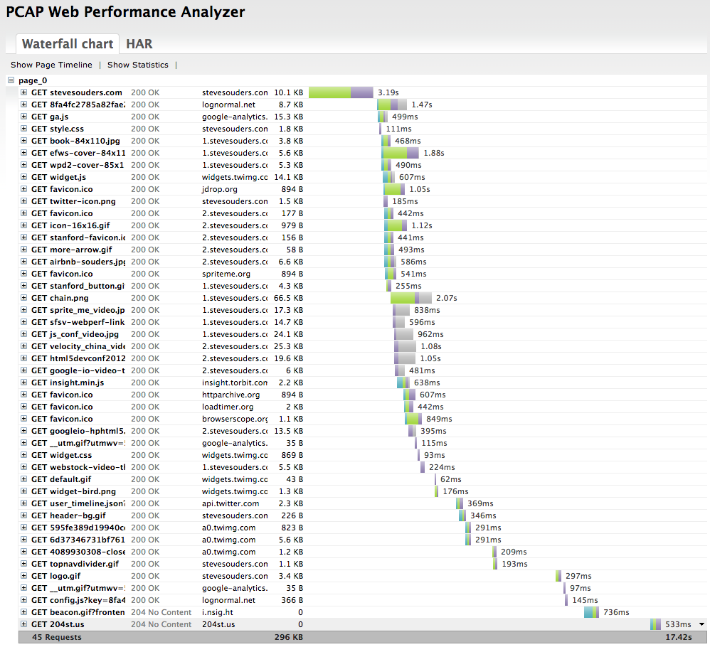
As a performance engineer my primary analysis tool is a waterfall chart. All major desktop browsers have embedded dev tools for generating waterfall charts. There are also out-of-browser tools, such as HttpWatch. Here’s an example waterfall chart from Chrome 25 for my website:

It took me about 3 minutes to generate this waterfall chart – and that includes the time to capture the screenshot and upload it to my server. While it’s easy to generate waterfall charts on the desktop, it’s much more time consuming to do this for mobile devices. The main solution for getting mobile waterfall charts is to use a remote debugger, but this is complicated:
- I don’t have every remote debugger installed on my laptop.
- Even if I have the appropriate remote debugger, they take time to setup and connect for each mobile device.
- There might not be a remote debugger for my particular mobile device.
my solution
The solution I would prefer is to have mobile browsers generate waterfall charts natively with the option to export them to a remote server for later analysis on a larger screen. (If you work on a mobile browser please add this!) Until this becomes a standard feature, I generate mobile waterfall charts by running tcpdump on my laptop and connecting my mobile device to it via a wifi hotspot.
This solution is as complex as setting up a remote debugger. In fact, it’s probably more complex. But it works for all mobile devices. Once I get it set up I can walk through all my various mobile devices to gather waterfall charts.
In the remainder of this blog post I’ll go over the specific step-by-step instructions for gathering mobile waterfall charts using this approach. The initial steps are heavily based on the pcaphar CaptureMobileTraffics page, but I go further to explain how to do this without a LAN connection going through a portable hotspot. These instructions are based on using my MacBook Air running 10.8.3.
1: wifi hotspot
I start by creating a wifi hotspot on my MacBook Air. This step assumes you’re connected to the Internet using an Ethernet connection. On my MacBook Air this is done using an Apple USB Ethernet Adaptor (aka, “dongle”).
- Open a shell terminal and run
ifconfig -a. Save the output – we’ll refer to it later. - Click on the Apple icon -> System Preferences…
- Click on “Sharing” in the Internet & Wireless section.
- Make sure the “Internet Sharing” service is highlighted on the left, but don’t select the checkbox just yet. (If the controls are disabled remember to click on the lock to enter the admin password.)
- For “Share your connection from:” select “USB Ethernet”. (This is where my laptop is getting its connection to the Internet.)
- For “To computers using:” select “Wi-Fi”. (This is where my laptop is sharing it’s Internet connection with others.)
- Click “Wi-Fi Options…”.
- For “Network Name:” I’ll enter “ss-laptop”.
- Leave “Security:” at “WPA2 Personal”.
- Enter an 8 character password.
- Click OK to save these Wi-Fi options.
- Select the checkbox next to “Internet Sharing” and choose “Start” when prompted.
The wifi hotspot should be active at this point. Connect your mobile device to the wifi hotspot you specified in step #6a, in my case “ss-laptop”. Navigate to some web pages on your mobile device to make sure it has an Internet connection.
To be certain my mobile device doesn’t fallback to the carrier network I often disable mobile data. On the iPhone (iOS 6) this is under Settings -> General -> Cellular. On my Samsung Galaxy Nexus (Android 4) this is under Settings -> Wireless & Networks More… -> Mobile networks.
You can confirm that your mobile device is using the laptop’s Internet connection by loading my HTTP Stuff page on both and making sure they have the same value for REMOTE_ADDR.
2: tcpdump
In this step we’ll capture some traffic from the mobile device.
I use tcpdump to capture the mobile device’s network requests. There are other tools you can use including Wireshark (formerly Ethereal). The tcpdump command is:
sudo tcpdump -i <iface> -n -s 0 -w <outfile> tcp or port 53
This generates a packet capture (pcap) file. You can specify any filename you want as the output file. I typically include the website I’m testing, the device I’m using, and the .pcap file extension, for example, “amazon-nexus.pcap”. Getting the correct interface is trickier. Run ifconfig -a again. For me the interface always starts with “en”, for example, “en1”. Look for an “en” interface that changed from “wifi hotspot” step 0 and now. For me it’s “en0”. I’m going to analyze https://stevesouders.com/ from my iPhone so I run this command in a shell:
sudo tcpdump -i en0 -n -s 0 -w souders-iphone.pcap tcp or port 53
Now I go to my iPhone (already connected to the “ss-laptop” wifi hotspot) and navigate to the page I want to analyze: https://stevesouders.com/. (If you’ve previously visited the page-to-be-analyzed then you might want to first clear your cache.) When it’s done loading I hit control-C to stop tcpdump. The souders-iphone.pcap file should be 300K+.
Protip: I create a BASH function to wrap the tcpdump command:
tcptrace ()
{
    if [ "" = "$1" ]; then
        declare outfile="aaa.pcap";
        echo "Using 'aaa.pcap' as the output file.";
    else
        declare outfile="$1";
    fi;
    if [ "" = "$2" ]; then
        declare iface="en1";
        echo "Using 'en1' as the interface.";
    else
        declare iface="$2";
    fi;
    sudo tcpdump -i $iface -n -s 0 -w $outfile tcp or port 53
}
With this function starting tcpdump is much simpler: tcptrace souders-iphone.pcap en0.
3: pcapperf
I use pcapperf to convert the pcap file to a HAR file and view it as a waterfall chart. pcapperf is an open source project from Bryan McQuade and Libo Song, both from Google. It’s very straightforward – simply upload the pcap file and you’ll see the waterfall chart.
Behind the curtains pcapperf uses the pcap2har project to convert the pcap file to a HAR file. HAR is a file format created by Jan Odvarko, Simon Perkins, and myself in 2009. It has become the industry standard for capturing web page loading information. It’s supported by Firebug, HttpWarch, IE 9+, Chrome, ShowSlow, WebPagetest, Fiddler, dynaTrace, Charles, and 20+ more. Jan (Honza) wrote the initial specification, and now there’s a draft W3C HAR spec. So once you have a HAR file you can use that in many other tools. For example, my HAR to PageSpeed tool generates a PageSpeed report from a HAR file enabling us to get a full PageSpeed analysis on our mobile pages.
4: USB wireless adapter
The steps so far work for most mobile developers who want to see waterfall charts – most people have a laptop that can run a wifi hotspot while connected to the Internet over Ethernet. For me, however, this wasn’t enough. I often don’t have an Ethernet connection. In fact, my laptop uses wifi 90%+ of the time. I especially want to capture mobile waterfalls during presentations where there often isn’t a LAN connection. But my MacBook Air, like most laptops, only has one wireless card. So I can’t be connected to wifi AND run a wifi hotspot. I used to get around this by carrying around a wireless router in my laptop bag – isn’t that convenient! You can see how I literally danced getting that to work during a tech talk at LinkedIn.
Now I have a better solution: I use a USB wireless adapter. It was hard to find one that worked on Mac OS. I settled on the netis WF-2111 150Mbps for ~$10. It comes with a Windows CD with the drivers, so I just downloaded them from the product page. When I plug the netis wireless adapter into my USB port the associated Wireless Network Utility starts up. I simply choose my normal wifi network from the Available Networks. Now I can remove my Ethernet cord and everything still works.
5: portable mobile hotspot
At this point we can generate mobile waterfall charts from any device even in the absence of an Ethernet connection. The main downside is it’s using a wifi connection – not a mobile carrier network. We can get a step closer to a true mobile experience by connecting the laptop to a portable hotspot running on a second mobile device. I do this on my Galaxy Nexus by going to Settings -> Wireless & Networks More… -> Tethering & portable hotspot -> Set up Wi-Fi hotspot. I use “ss-nexus” as the Network SSID, create a password, and Save. Clicking Portable Wi-Fi hotspot turns it on.
Returning to the Wireless Network Utility on my laptop I connect the netis USB wireless adapter to “ss-nexus”. I might have to re-connect the first mobile device (my iPhone in this case) to “ss-laptop” since it might have dropped that connection when the laptop switched to “ss-nexus”. The setup at this point is:
- The mobile device I’m testing (my iPhone) is connected to “ss-laptop” – the wifi hotspot running on my MacBook Air.
- My MacBook Air is using the netis USB wireless adapter to connect to “ss-nexus” – the portable hotspot on my Galaxy Nexus.
- My Galaxy Nexus is connected to the Internet via its mobile carrier network (T-Mobile).
With this setup I can capture a waterfall chart from any mobile device with all the traffic going over a mobile carrier network. Here’s the waterfall for https://stevesouders.com/ on my iPhone going over T-Mobile:
This is a lot of steps and is likely more complex than using a remote debugger. But I like that it’s one setup that works for all mobile devices, even devices that don’t have a remote debugger. What I’d really like is to have a waterfall chart capturing feature built into mobile browsers directly. This could be viewable on the mobile device, but could very easily be a HAR file that could be uploaded, viewed, and analyzed in the many tools that support HAR. Until then, I’ll just keep my tiny USB wireless adapter handy – that’s a lot easier than carrying a wireless router everywhere I go.
WebPerfDays: Performance Tools
I just returned from Velocity Europe in London. It was stellar. And totally exhausting! But this post is about the other fantastic web performance event that took place after Velocity: WebPerfDays London.
WebPerfDays is like a day-long web performance meetup event. Aaron Kulick organized the first one last June right after Velocity US. He had the brilliant idea to grab webperfdays.org with the goal of starting a series of events modeled after DevOpsDay. The intent is for other people to organize their own WebPerfDays events. All the resources are meant to be shared – the website, domain, templates, Twitter handle, etc.
Stephen Thair continued the tradition by organizing last week’s WebPerfDays in London. It was held at Facebook’s new London office. They contributed their space on the top floor with beautiful views. (Sorry for the broken sofa.) WebPerfDays is an UNconference, so the agenda was determined by the attendees. I nominated a session on performance tools based on two questions:
What’s your favorite web performance tool?
What tools are missing?
Here are the responses gathered from the attendees:
Favorite Performance Tool:
- WebPagetest
- Cuzillion
- Chrome Dev Tools
- Speed Tracer
- Performance Analyzer from Site Confidence (pay)
- SPOF-O-Matic, 3PO for YSlow
- Wireshark
- PageSpeed, YSlow
- dynaTrace Ajax Edition and SpeedoftheWeb
- HTTP Archive
- Critical Path Explorer – part of PageSpeed Insights
- PhantomJS
- mobile remote debugging: Weinre, jsconsole.com, Opera Dragonfly, Chrome for Android
- Apache Bench (ab)
- Show Slow
- Browserscope
- Tilt, DOM Monster
- Mobileperf Bookmarklet
- chrome://net-internals
- Redbot
- SpriteMe
- Boomerang, Episodes
- wget, telnet
- Wappalyzer
- Netalyzer
- Shunra NetworkCatcher Express
- Packet Flight
- Fiddler, Charles
- CSS Lint, JSLint
- GTMetrix
Updates:
- Torbit Insight
- Grunt.js
- sitespeed.io
- SSL Server Test
- SPDY Indicator (Firefox, Chrome), SPDYCheck.org
- KITE, MITE
- Compass (CSS)
- Soke, Seige, Tsung (load testing)
- SpeedCheckr
Missing Tools:
- When analyzing a website need a tool that calculates the average delta between last-modified date and today and compare that to the expiration time. The goal is to indicate to the web developer if the expiration window is commensurate with the resource change rate. This could be part of PageSpeed, YSlow, and HTTP Archive, for example.
- Automated tool that determines if a site is using a blocking snippet when an async snippet is available. For example, PageSpeed does this but only for Google Analytics.
- Tools that diagnose the root cause for rendering being delayed.
- Easier visibility into DNS TTLs, e.g., built into Chrome Dev Tools and WebPagetest.
- Backend tool that crawls file directories and optimizes images. Candidate tools: Yeoman, Wesley.
- Nav Timing in (mobile) Safari.
- Better tools for detecting and diagnosing memory leaks.
- Web timing specs for time spent on JavaScript, CSS, reflow, etc. (available in JavaScript).
- Tools to visualize and modify Web Storage (localStorage, app cache, etc.).
- Tools to visualize and clear DNS cache.
- A version of JSLint focused on performance suggestions.
- A tool that can diff two HAR files.
Updates:
- in-browser devtools letting you drill into each resource fetched or cached, listing the full set of reasons (down to the combination of http headers at play in the current and, as applicable, a prior request) for why that resource was or wasn’t loaded from the cache, when it would get evicted from cache and why: https://bugs.webkit.org/show_bug.cgi?id=83986
This was stream of consciousness from the audience. It’s not an exhaustive list. Do you have a favorite web performance tool that’s not listed? Or a performance analysis need without a tool to help? If so, add a comment below. And consider organizing WebPerfDays in your area. Aaron, Stephen, and I would be happy to help.
Making the HTTP Archive faster
This week I finally got time to do some coding on the HTTP Archive. Coincidentally (ironically?) I needed to focus on performance. Hah! This turned out to be a good story with a few takeaways – info about the HTTP Archive, some MySQL optimizations, and a lesson learned about dynamic script loaders.
Setting the stage
The HTTP Archive started in November 2010 by analyzing 10K URLs and storing their information (subresource URLs, HTTP headers, sizes, etc.) in a MySQL database. We do these runs twice each month. In November 2011 we began increasing the number of URLs to 25K, 50K, 75K, and finally hit 100K this month. Our goal is to hit 1M URLs by the end of 2012.

The MySQL schema in use today is by-and-large the same one I wrote in a few hours back in November 2010. I didn’t spend much time on it – I’ve created numerous databases like this and was able to quickly get something that got the job done and was fast. I knew it wouldn’t scale as the size of the archive and number of URLs grew, but I left that for another day.
That day had arrived.
DB schema
The website was feeling slow. I figured I had reached that curve in the hockey stick where my year-old schema that worked on two orders of magnitude less data was showing its warts. I saw plenty of slow queries in the log. I occasionally did some profiling and was easily able to identify queries that took 500 ms or more; some even took 10+ seconds. I’ve built big databases before and had some tricks up my sleeve so I sat down today to pinpoint the long poles in the tent and cut them down.
The first was pretty simple. The urls table has over 1M URLs. The only index was based on the URL string – a blob. It took 500-1000 ms to do a lookup. The main place this happens is looking up the URL’s rank, for example, in the last crawl Whole Foods was ranked 5,872 (according to Alexa). This is a fairly non-critical piece of information, so slowing down the page 500-1000 ms wasn’t acceptable. Plus this seems like a simple lookup ripe for optimizing.
When I described this problem to my Velocity co-chair, John Allspaw, he suggested creating a hash for the URL that would be faster to index. I understood the concept but had never done this before. I didn’t find any obvious pointers out there on “the Web” so I rolled my own. I started with md5(), but that produced a fairly long string that was alphanumeric (hex):
select md5("http://www.wholefoodsmarket.com/");
=> 0a0936fe5c690a3b468a6895efaaff83
I didn’t think it would be that much faster to index off the md5() hex string (although I didn’t test this). Assuming that md5() strings are evenly distributed, I settled on taking a substring:
select substring(md5("http://www.wholefoodsmarket.com/"), 1, 4);
=> 0a09
This was still hex and I thought an int would be a faster index (but again, I didn’t test this). So I added a call to conv() to convert the hex to an int:
select conv(substring(md5("http://www.wholefoodsmarket.com/"), 1, 4), 16, 10);
=> 2569
I was pretty happy. This maps URLs across 64K hashes. I’m assuming they’re evenly distributed. This conversion is only done a few times per page so the overhead is low. If you have a better solution please comment below, but overall I thought this would work – and it did! Those 500+ ms queries went down to < 1 ms. Yay!
But the page was still slow. Darn!
Duh – it’s the frontend
This and a few other MySQL changes shaved a good 2-3 seconds of the page load time but the page still felt slow. The biggest problem was rendering – I could tell the page arrived quickly but something was blocking the rendering. This is more familiar performance territory for me so I gleefully rolled up my sleeves and pulled out my WPO toolbox.
The page being optimized is viewsite.php. I used WebPagetest to capture a waterfall chart and screenshots for Chrome 18, Firefox 11, IE 8, and IE 9. The blocking behavior and rendering times were not what I consider high performance. (Click on the waterfall chart to go to the detailed WebPagetest results.)
Chrome 18:

Firefox 11:

Internet Explorer 8:

Internet Explorer 9:

These waterfall charts looked really wrong to me. The start render times (green vertical line) were all too high: Chrome 1.2 seconds, Firefox 2.6 seconds, IE8 1.6 seconds, and IE9 2.4 seconds. Also, too many resources were downloading and potentially blocking start render. This page has a lot of content, but most of the scripts are loaded asynchronously and so shouldn’t block rendering. Something was defeating that optimization.
Docwrite blocks
I immediately honed in on jquery.min.js because it was often in the critical path or appeared to push out the start render time. I saw in the code that it was being loaded using Google Libraries API. Here’s the code that was being used to load jquery.min.js:
<script src="http://www.google.com/jsapi"></script>
<script>
google.load("jquery", "1.5.1");
</script>
I’ve looked at (and built) numerous async script loaders and know there are a lot of details to get right, so I dug into the jsapi script to see what was happening. I saw the typical createElement-insertBefore pattern popularized by the Google Analytics async snippet. But upon walking through the code I discovered that jquery.min.js was being loaded by this line:
m.write('<script src="'+b+'" type="text/javascript"><\/script>'):
The jsapi script was using document.write to load jquery.min.js. While it’s true that document.write has some asynchronous benefits, it’s more limited than the createElement-insertBefore pattern. Serendipitously, I was just talking with someone a few weeks ago about deprecating the jsapi script because it introduces an extra HTTP request, and instead recommend that people just load the script directly. So that’s what I did.
We don’t need no stinkin’ script loader
In my case I knew that jquery.min.js could be loaded async, so I replaced the google.load code with this:
var sNew = document.createElement("script");
sNew.async = true;
sNew.src = "http://ajax.googleapis.com/ajax/libs/jquery/1.5.1/jquery.min.js";
var s0 = document.getElementsByTagName('script')[0];
s0.parentNode.insertBefore(sNew, s0);
This made the start render times and waterfall charts look much better:
Chrome 18:

Firefox 11:

Internet Explorer 8:

Internet Explorer 9:

There was better parallelization of downloads and the start render times improved. Chrome went from 1.2 to 0.9 seconds. Firefox went from 2.6 to 1.3 seconds. IE8 went from 1.6 to 1.1 seconds. IE9 went from 2.4 to 1.0 seconds.
This was a fun day spent making the HTTP Archive faster. Even though I consider myself a seasoned veteran when it comes to web performance, I still found a handful of takeaways including some oldies that still ring true:
- Even for web pages that have significant backend delays, don’t forget to focus on the frontend. After all, that is the Performance Golden Rule.
- Be careful using script loaders. They have to handle diverse script loading scenarios across a large number of browsers. If you know what you want it might be better to just do it yourself.
- Be careful using JavaScript libraries. In this case
jquery.min.jsis only being used for the drop down About menu. That’s 84K (~30K compressed) of JavaScript for a fairly simple behavior.
If you’re curious about why document.write results in worse performance for dynamic script loading, I’ll dig into that in tomorrow’s blog post. Hasta mañana.
JavaScript Performance
Last night I spoke at the San Francisco JavaScript Meetup. I gave a brand new talk called JavaScript Performance that focuses on script loading and async snippets. The snippet example I chose was the Google Analytics async snippet. The script-loading part of that snippet is only six lines, but a lot of thought and testing went into it. It’s a great prototype to use if you’re creating your own async snippet. I’ll tweet if/when the video of my talk comes out, but in the meantime the slides (Slideshare, pptx) do a good job of relaying the information.
There are two new data points from the presentation that I want to call out in this blog post.
Impact of JavaScript
The presentation starts by suggesting that JavaScript is typically the #1 place to look for making a website faster. My anecdotal experience supports this hypothesis, but I wanted to try to do some quantitative verification. As often happens, I turned to WebPagetest.
I wanted to test the Alexa Top 100 URLs with and without JavaScript. To load these sites withOUT JavaScript I used WebPagetest’s “block” feature. I entered “.js” which tells WebPagetest to ignore every HTTP request with a URL that contains that string. Each website was loaded three times and the median page load time was recorded. I then found the median of all these median page load times.
The median page load with JavaScript is 3.65 seconds. Without JavaScript the page load time drops to 2.487 seconds – a 31% decrease. (Here’s the data in WebPagetest: with JavaScript, without JavaScript.) It’s not a perfect analysis: Some script URLs don’t contain “.js” and inline script blocks are still executed. I think this is a good approximation and I hope to do further experiments to corroborate this finding.

Async Execution Order & Onload
The other new infobyte has to do with the async=true line from the GA async snippet. The purpose of this line is to cause the ga.js script to not block other async scripts from being executed. It turns out that some browsers preserve the execution order of scripts loaded using the insertBefore technique, which is the technique used in the GA snippet:
ga.type = ‘text/javascript’;
ga.async = true;
ga.src = (‘https:’ == document.location.protocol ? ‘https://ssl’ : ‘http://www’) + ‘.google-analytics.com/ga.js’;
var s = document.getElementsByTagName(‘script’)[0];
s.parentNode.insertBefore(ga, s);
Preserving execution order of async scripts makes the page slower. If the first async script takes a long time to download, all the other async scripts are blocked from executing, even if they download sooner. Executing async scripts immediately as they’re downloaded results in a faster page load time. I knew old versions of Firefox had this issue, and setting async=true fixed the problem. But I wanted to see if any other browsers also preserved execution order of async scripts loaded this way, and whether setting async=true worked.
To answer these questions I created a Browserscope user test called Async Script Execution Order. I tweeted the test URL and got 348 results from 60+ different browsers. (Thanks to all the people that ran the test! I still need results from more mobile browsers so please run the test if you have a browser that’s not covered.) Here’s a snapshot of the results:

The second column shows the results of loading two async scripts with the insertBefore pattern AND setting async=true. The third column shows the results if async is NOT set to true. Green means the scripts execute immediately (good) and red indicates that execution order is preserved (bad).
The results show that Firefox 3.6, OmniWeb 622, and all versions of Opera preserve execution order. Setting async=true successfully makes the async scripts execute immediately in Firefox 3.6 and OmniWeb 622, but not in Opera. Although this fix only applies to a few browsers, its small cost makes it worthwhile. Also, if we get results for more mobile browsers I would expect to find a few more places where the fix is necessary.
I also tested whether these insertBefore-style async scripts block the onload event. The results, shown in the fourth column, are mixed if we include older browsers, but we see that newer browsers generally block the onload event when loading these async scripts – this is true in Android, Chrome, Firefox, iOS, Opera, Safari, and IE 10. This is useful to know if you wonder why you’re still seeing long page load times even after adopting async script loading. It also means that code in your onload handler can’t reliably assume async scripts are loaded because of the many browsers out there that do not block the onload event, including IE 6-9.
And a final shout out to the awesomeness of the Open Source community that makes tools like WebPagetest and Browserscope available – thanks Pat and Lindsey!
Loadtimer: a mobile test harness
Measuring mobile performance is hard
When Amazon announced their Silk browser I got excited reading about the “split architecture”. I’m not big on ereaders but I pre-ordered my Kindle Fire that day. It arrived a week or two ago. I’ve been playing with it trying to find a scientific way to measure page load times for various websites. It’s not easy.
- Since it’s a new browser and runs on a tablet we don’t have plugins like Firebug.
- It doesn’t (yet) support the Navigation Timing spec, so even though I can inspect pages using Firebug Lite (via the Mobile Perf bookmarklet) and Weinre (I haven’t tried it but I assume it works), there’s no page load time value to extract.
- Connecting my Fire to a wifi hotspot on my laptop running tcpdump (the technique evangelized by pcapperf) doesn’t work in accelerated mode because Silk uses SPDY over SSL. This technique works when acceleration is turned off, but I want to see the performance optimizations.
While I was poking at this problem a bunch of Kindle Fire reviews came out. Most of them talked about the performance of Silk, but I was disappointed by the lack of scientific rigor in the testing. Instead of data there were subjective statements like “the iPad took about half as long [compared to Silk]” and “the Fire routinely got beat in rendering pages but often not by much”. Most of the articles did not include a description of the test procedures. I contacted one of the authors who confided that they used a stopwatch to measure page load times.
If we’re going to critique Silk and compare its performance to other browsers we need reproducible, unbiased techniques for testing performance. Using a stopwatch or loading pages side-by-side and doing a visual comparison to determine which is faster are not reliable methods for measuring performance. We need better tools.
Introducing Loadtimer
Anyone doing mobile web development knows that dev tools for mobile are lacking. Firebug came out in 2006. We’re getting close to having that kind of functionality in mobile browsers using remote debuggers, but it’s pretty safe to say the state of mobile dev tools is 3-5 years behind desktop tools. It might not be sexy, but there’s a lot to be gained from taking tools and techniques that worked on the desktop and moving them to mobile.
In that vein I’ve been working the last few days to build an iframe-based test harness similar to one I built back in 2003. I call it Loadtimer. (I was shocked to see this domain was available – that’s a first.) Here’s a screenshot:

The way it works is straightforward:
- It’s preloaded with a list of popular URLs. The list of URLs can be modified.
- The URLs are loaded one-at-a-time into the iframe lower in the page.
- The iframe’s onload time is measured and displayed on the right next to each URL.
- If you check “record load times” the page load time is beaconed to the specified URL. The beacon URL defaults to point to loadtimer.org, but you can modify it if, for example, you’re testing some private pages and want the results to go to your own server.
- You can’t test websites that have “framebusting” code that prevents them from being loaded in an iframe, such as Google, YouTube, Twitter, and NYTimes.
There are some subtle optimizations worth noting:
- You should clear the cache between each run (unless you explicitly want to test the primed cache experience). There’s no way for the test harness to clear the cache, but it does have a check that helps remind you to clear the cache. (It loads a script that is known to take 3 seconds to load – if it takes less than 3 seconds it means the cache wasn’t cleared.)
- It’s possible that URL 1’s unload time could make URL 2’s onload time be longer than it actually should be. To avoid this
about:blankis loaded between each URL. - The order of the preset URLs is randomized to mitigate biases across URLs, for example, where URL 1 loads resources used by URL 2.
Two biases that aren’t addressed by Loadtimer:
- DNS resolutions aren’t cleared. I don’t think there’s a way to do this on mobile devices short of power cycling. This could be a significant issue when comparing Silk with acceleration on and off. When acceleration is on there’s only one DNS lookup, whereas when acceleration is off there’s a DNS lookup for each hostname in the page (13 domains per page on average). Having the DNS resolutions cached gives an advantage to acceleration being off.
- Favicons aren’t loaded for websites in iframes. This probably has a negligible impact on page load times.
 Have at it
The nice thing about the Loadtimer test harness is that it’s web-based – nothing to install. This ensures it’ll work on all mobile phones and tablets that support JavaScript. The code is open source. There’s a forum for questions and discussions.
There’s also a results page. If you select the “record load times” checkbox you’ll be helping out by contributing to the crowdsourced data that’s being gathered. Getting back to what started all of this, I’ve also been using Loadtimer the last few days to compare the performance of Silk to other tablets. Those results are the topic of my next blog post – see you there.
UA switching: be careful
At least once a day I’m in a conversation, email thread, or twitter exchange about monitoring websites. Lately this has focused on mobile. Tools like WebPagetest make it easier to monitor websites from the perspective of a desktop browser, but doing this from the perspective of a mobile device is still a significant challenge.
This issue is a current topic of discussion around HTTP Archive Mobile. Blaze.io supports the project through its Mobitest framework: every two weeks I submit 1000 URLs to their framework which downloads each URL 3 times on a real iPhone. I love that the resultant waterfall chart and screenshots are gathered from a real phone. But our next step is to scale this up to 100K and then 1M URLs. It’s going to be hard to scale up to this using real phones due to cost and maintenance issues.
Another alternative is to use an emulator. The timings won’t be identical to the actual mobile device, but HTTP Archive Mobile is more focused on HTTP headers, size and number of responses, etc. These structural aspects of the page should be identical between the actual phone and its emulator. We’ll soon do side-by-side tests to confirm this.
But this post is about a third alternative: UA switching. Changing the User-Agent string of a desktop browser to mimic a mobile browser and using that to gather the data could be accomplished this afternoon. The issue is that the results might differ from what is seen on an actual phone. Websites that don’t do anything special for mobile would probably be similar enough. And websites that look at the UA string on the serverside to determine how to alter the page would also be okay. But websites that adapt the page based on browser feature detection on the clientside, e.g. responsive web design, would differ dramatically.
When asked for an example of such a site I recalled seeing Scott Jehl at Breaking Development Conference talking about the recent launch of Boston Globe using responsive web design. It’s an amazing feat of engineering. Its adaptability from a single code base across so many devices is beautiful to watch in this promo video.
Because the Boston Globe uses responsive web design, the UI varies depending on the browser – not the UA string. Here’s a screenshot from my iPhone. The content has been modified to fit on the iPhone’s smaller screen.

Figure 1. iPhone browser
Figure 2 shows the Boston Globe as rendered inside Chrome on my laptop. Since the screen is much bigger the content is laid out quite differently compared to the iPhone. We see three columns instead of one, a wider horizontal navigation bar, etc.

Figure 2. Chrome
Figure 3 is also from Chrome, but in this case I changed the User-Agent string to mimic an iPhone:
Mozilla/5.0 (iPhone; U; CPU iPhone OS 4_3_1 like Mac OS X; en-us) AppleWebKit/533.17.9 (KHTML, like Gecko) Version/5.0.2 Mobile/8J2 Safari/6533.18.5Even though the UA string says “iPhone”, the page is laid out exactly as it is for normal Chrome. (I confirmed the UA string by inspecting HTTP headers.)

Figure 3. Chrome with iPhone User-Agent string
Responsive web design is fairly new. There are still a number of websites that modify the HTML layout based on serverside UA detection. In fact, while generating the screenshot for Figure 3 I tried several other websites and most of them returned a layout customized for iPhone.
If you’re working on a framework to monitor mobile websites, be careful about taking the UA switching approach. If the websites you’re monitoring do serverside UA detection, you’ll probably be okay. But if the web app is based on clientside feature detection, the results you receive from UA switching won’t match what is seen on real mobile devices. As the adoption of responsive web design increases so will the number of websites that fall into this gap of mismeasurement. Real devices or emulators are a safer bet.
Storager case study: Bing, Google
Storager
Last week I posted my mobile comparison of 11 top sites. One benefit of analyzing top websites is finding new best practices. In that survey I found that the mobile version of Bing used localStorage to reduce the size of their HTML document from ~200 kB to ~30 kB. This is a good best practice in general and makes even more sense on mobile devices where latencies are higher, caches are smaller, and localStorage is widely supported.
I wanted to further explore Bing’s use of localStorage for better performance. One impediment is that there’s no visibility into localStorage on a mobile device. So I created a new bookmarklet, Storager, and added it to the Mobile Perf uber bookmarklet. (In other words, just install Mobile Perf – it bundles Storager and other mobile bookmarklets.)
Storager lets you view, edit, clear, and save localStorage for any web page on any browser – including mobile. Viewing localStorage on a 320×480 screen isn’t ideal, so I did the obvious next step and integrated Storager with Jdrop. With these pieces in place I’m ready to analyze how Bing uses localStorage.
Bing localStorage
My investigation begins by loading Bing on my mobile device – after the usual redirects I end up at the URL http://m.bing.com/?mid=10006. Opening Storager from the Mobile Perf bookmarklet I see that localStorage has ~10 entries. Since I’m not sure when these were written to localStorage I clear localStorage (using Storager) and hit reload. Opening Storager again I see the same ~10 entries and save those to Jdrop. I show the truncated entries below. I made the results public so you can also view the Storager results in Jdrop.
BGINFO: {"PortraitLink":"http://www.bing.com/fd/hpk2/Legzira_EN-US262...
CApp.Home.FD66E1A3: #ContentBody{position:relative;overflow:hidden;height:100%;-w...
CUX.Keyframes.B8625FE...: @-webkit-keyframes scaleout{from{-webkit-transform:scale3d(1,...
CUX.Site.18BDD936: *{margin:0;padding:0}table{border-collapse:separate;border-sp...
CUX.SiteLowRes.C8A1DA...: .blogoN{background-image:url(data:image/png;base64,iVBORw0KGg...
JApp.Home.DE384EBF: (function(){function a(){Type.registerNamespace("SS");SS.Home...
JUX.Compat.0907AAD4: function $(a){return document.getElementById(a)}var FireEvent...
JUX.FrameworkCore.A39...: (function(){function a(){Type.registerNamespace("BM");AjaxSta...
JUX.MsCorlib.172D90C3: window.ss={version:"0.6.1.0",isUndefined:function(a){return a...
JUX.PublicJson.540180...: if(!this.JSON)this.JSON={};(function(){function c(a){return a...
JUX.UXBaseControls.25...: (function(){function a(){Type.registerNamespace("UXControls")...
RMSM.Keys: CUX.Site.18BDD936~CUX.Keyframes.B8625FEE~CApp.Home.FD66E1A3~C...
These entries are written to localStorage as part of downloading the Bing search page. These entries add up to ~170 kB in size (uncompressed). This would explain the large size of the Bing HTML document on mobile. We can verify that these keys are downloaded via the HTML document by searching for a unique string from the data such as “FD66E1A3”. We find this string in the Bing document source (saved in Jdrop) as the id of a STYLE block:
<style data-rms="done" id="CApp.Home.FD66E1A3" rel="stylesheet" type="text/css">
#ContentBody{position:relative;overflow:hidden;height:100%;-webkit-tap-highlight-color:...
Notice how the content of this STYLE block matches the data in localStorage. The other localStorage entries also correspond to SCRIPT and STYLE blocks in the initial HTML document. Bing writes these blocks to localStorage and then on subsequent page views reads them back and inserts them into the document resulting in a much smaller HTML document download size. The Bing server knows which blocks are in the client’s localStorage via a cookie, where the cookie is comprised of the localStorage keys delimited by “~”:
RMSM=JApp.Home.DE384EBF~JUX.UXBaseControls.252CB7BF~JUX.FrameworkCore.A39F6425~
JUX.PublicJson.540180A4~JUX.Compat.0907AAD4~JUX.MsCorlib.172D90C3~CUX.SiteLowRes.C8A1DA4E~
CApp.Home.FD66E1A3~CUX.Keyframes.B8625FEE~CUX.Site.18BDD936~;
Just to be clear, everything above happens during the loading of the blank Bing search page. Once a query is issued the search results page downloads more keys (~95 kB additional data) and expands the cookie with the new key names.
Google localStorage
Another surprise from last week’s survey was that the mobile version of Google Search had 68 images in the results HTML document as data: URIs, compared to only 10 for desktop and iPad. Mobile browsers open fewer TCP connections and these connections are typically slower compared to desktop, so reducing the number of HTTP requests is important.
The additional size from inlining data: URIs doesn’t account for the large size of the Google Search results page, so perhaps localStorage is being seeded here, too. Using Storager we see over 130 entries in localStorage after a search for flowers. Here’s a sample. (As before, the key names and values may be truncated.)
mres.-8Y5Dw_nSfQztyYx: <style>a{color:#11c}a:visited{color:#551a8b}body{margin:0;pad...
mres.-Kx7q38gfNkQMtpx: <script> //<![CDATA[ var Zn={},bo=function(a,b){b&&Zn[b]||(ne...
mres.0kH3gDiUpLA5DKWN: <style>.zl9fhd{padding:5px 0 0}.sc59bg{clear:both}.pyp56b{tex...
mres.0thHLIQNAKnhcwR4: <style>.fdwkxt{width:49px;height:9px;background:url("data:ima...
mres.36ZFOahhhEK4t3WE: <script> //<
The motivation for Jdrop came from my recent focus on mobile and subsequent launch of bookmarklets for mobile devices (Mobile Perf and Page Resources, followed by Docsource). I like using bookmarklets because they run on all mobile browsers that support JavaScript. Finally – some visibility into mobile performance!
My enthusiasm ebbed once I started using these bookmarklets, however. The information gathered and displayed by these bookmarklets overwhelms the tiny screens on mobile devices. I’m adamant about gathering performance data on actual mobile devices. I don’t want to use emulators or UA switching from my desktop – these techniques introduce bias in the analysis (differences in cache size, connection limits, etc.). Also, they overlook the impact of mobile carrier networks.
I realized what I wanted to do was gather the data on the mobile device, but analyze that data remotely.
Bookmarklets basically perform those two steps: gather data and display data. It was pretty simple to insert a step to save the data to Jdrop. Once the data is in the cloud, it can be accessed from anywhere especially desktops with more screen real estate. The bookmarklet’s display code is easily re-used by wrapping the data in JSON and passing it back to the display code inside Jdrop’s web page. That, in a nutshell, is Jdrop.

I integrated Jdrop with my two bookmarklets: Page Resources and Docsource. And I’m ecstatic to announce that Thomas Fuchs added Jdrop to his DOM Monster bookmarklet. When you run these bookmarklets you see a new “save to Jdrop” link.
All of these bookmarklets, plus others, are in the uber Mobile Perf bookmarklet. The full set of steps are as follows:
On your mobile device:
- sign in to Jdrop
- install the Mobile Perf bookmarklet
- run Page Resources, Docsource, or DOM Monster and click “save to Jdrop”
On your desktop or laptop:
- sign in to Jdrop
- click on “My JSON” to view the data you saved
If you have or want to build a bookmarklet focused on mobile performance, I encourage you to integrate it with Jdrop. The Jdrop devdocs explain the necessary changes.
Jdrop is in alpha mode. You’ll likely find bugs or think of new features – if so please add them to the list of issues. Jdrop is open source so you can see all the code. A huge shout out to James Pearce who wrote a ton of code including oauth-php and almost all of the UI.
I gave a sneak peek of Jdrop at my workshop today at Webstock. Along with Jdrop I also demoed the new Blaze Mobile Performance Tool and pcapperf. We’ve got the beginnings of a mobile performance toolkit. I’m starting to gather more data (on my mobile devices) and analyzing that data (on my desktop) thanks to Jdrop and these other tools. I look forward to working with the mobile dev community to create more tools and use those to make a faster mobile web.

Blaze.io launches WPT with mobile devices
About 30 minutes ago Blaze.io launched the Blaze Mobile Performance Tool. This is incredibly exciting. I’ve only played with it a little bit but I wanted to blog about it ASAP to make people aware. Note that the service might get overrun today and tomorrow – so be patient and come back later if you have to.
Everyone reading this hopefully knows about WebPagetest. I consider WebPagetest to be one of the most important performance tools released – ever. Pat Meenan has done an amazing amount of work on it. The reason I think it’s so important is it dramatically lowers the bar for doing performance analysis. You don’t need to install a plugin or exe – all you need is a browser. It’s no coincidence that over a dozen companies including Aptimize, Strangeloop Networks, and Catchpoint have volunteered to host instances of WebPagetest in locations across the globe. Being able to get an HTTP waterfall chart, a Page Speed report, connection info, and screenshots all from one tool is powerful.
Building on the WebPagetest framework, the folks at Blaze.io cracked open some iPhones and Androids and hooked them up. This is a first version so not every feature is available, and my Android tests showed a few quirks that need to be investigated, but this is a great first step.

As shown in the screenshot above, you can see a picture of the site you tested and play a video of that site loading. Clicking on the waterfall chart shows a large version. Right now this doesn’t have a detailed breakdown (DNS, connect, wait, download, etc.). The test I did using their Android device had some resources showing a “1 ms” download time – obviously an issue to investigate. The page size seems larger than expected – I’m assuming this is uncompressed size versus the actual bytes transferred.
I’m sure they have a long todo list. I’d like to see integration with Page Speed. They have a link to view the HAR file. The provided link goes directly to Honza‘s online HAR Viewer. With a little wrangling I was able to download the HAR file to disk and upload it to my HAR to Page Speed tool to get a Page Speed report. More devices would be a huge win.
I’m doing a workshop next week at Webstock on mobile performance tools. I’m so psyched to have another one to show off. Great work Blaze.io!