Announcing the HTTP Archive
I’m proud to announce the release of the HTTP Archive. From the mission statement:
Successful societies and institutions recognize the need to record their history – this provides a way to review the past, find explanations for current behavior, and spot emerging trends. In 1996 Brewster Kahle realized the cultural significance of the Internet and the need to record its history. As a result he founded the Internet Archive which collects and permanently stores the Web’s digitized content.
In addition to the content of web pages, it’s important to record how this digitized content is constructed and served. The HTTP Archive provides this record. It is a permanent repository of web performance information such as size of pages, failed requests, and technologies utilized. This performance information allows us to see trends in how the Web is built and provides a common data set from which to conduct web performance research.
The HTTP Archive code is open source and the data is downloadable. Approximately 17,000 top websites are examined every two weeks. I started gathering the data in October 2010. The list of URLs is derived from various sources including Alexa, Fortune 500, and Quantcast. The system is built on the shoulders of WebPagetest which downloads each URL and gathers a HAR file, screenshots, video of the site loading, and other information. From this information the HTTP Archive extracts data, stores it in a database, aggregates the data, and provides various statistical analyses.
This chart is one of the many interesting stats from the HTTP Archive. It shows the number of bytes downloaded for the average web page broken out by content type.
In addition to interesting stats for an individual run, the HTTP Archive also has trending charts. For example, this chart shows the total transfer size of web pages has increased 88 kB (15%) over the last six month. (In order to compare apples-to-apples, since the list of top sites can change month to month, these comparisons are done using the intersection of ~1100 URLs analyzed in every run.)
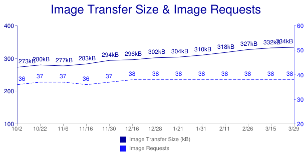
The likely cause for this increase is size of images. The next chart shows that the total transfer size of images increased 61 kB (22%) over the same time period, even though the total number of image requests only increased by two (6%). Why did the size of images grow so much? This highlights one of the benefits of the HTTP Archive. Anyone who wants to answer that question can download the data and perform an analysis. Possible things to check include if the ratio of JPG images increased (since the average size of JPG images is 14 kB compared to 3 kB for GIF and 8 kB for PNG) and whether the increase occurs across most images in the page or a few larger images.
There are hours of slicing and dicing in store for performance engineers and anyone who loves data. About 20 charts are available today. More will come (add suggestions to the list of isues). The most important thing to remember is the data is being collected and archived, and will be accessible to new views that are added in the future.
Check out the FAQ for more information. I encourage you to join the HTTP Archive group in order to follow our progress and add to the discussion. Once there you’ll see the first email from Brewster Kahle who says “Fantastic! I have not seen such a wealth of information on the performance of the web recorded and so enriched.” I hope you too will find it worthwhile.
Storager case study: Bing, Google
Storager
Last week I posted my mobile comparison of 11 top sites. One benefit of analyzing top websites is finding new best practices. In that survey I found that the mobile version of Bing used localStorage to reduce the size of their HTML document from ~200 kB to ~30 kB. This is a good best practice in general and makes even more sense on mobile devices where latencies are higher, caches are smaller, and localStorage is widely supported.
I wanted to further explore Bing’s use of localStorage for better performance. One impediment is that there’s no visibility into localStorage on a mobile device. So I created a new bookmarklet, Storager, and added it to the Mobile Perf uber bookmarklet. (In other words, just install Mobile Perf – it bundles Storager and other mobile bookmarklets.)
Storager lets you view, edit, clear, and save localStorage for any web page on any browser – including mobile. Viewing localStorage on a 320×480 screen isn’t ideal, so I did the obvious next step and integrated Storager with Jdrop. With these pieces in place I’m ready to analyze how Bing uses localStorage.
Bing localStorage
My investigation begins by loading Bing on my mobile device – after the usual redirects I end up at the URL http://m.bing.com/?mid=10006. Opening Storager from the Mobile Perf bookmarklet I see that localStorage has ~10 entries. Since I’m not sure when these were written to localStorage I clear localStorage (using Storager) and hit reload. Opening Storager again I see the same ~10 entries and save those to Jdrop. I show the truncated entries below. I made the results public so you can also view the Storager results in Jdrop.
BGINFO: {"PortraitLink":"http://www.bing.com/fd/hpk2/Legzira_EN-US262...
CApp.Home.FD66E1A3: #ContentBody{position:relative;overflow:hidden;height:100%;-w...
CUX.Keyframes.B8625FE...: @-webkit-keyframes scaleout{from{-webkit-transform:scale3d(1,...
CUX.Site.18BDD936: *{margin:0;padding:0}table{border-collapse:separate;border-sp...
CUX.SiteLowRes.C8A1DA...: .blogoN{background-image:url(data:image/png;base64,iVBORw0KGg...
JApp.Home.DE384EBF: (function(){function a(){Type.registerNamespace("SS");SS.Home...
JUX.Compat.0907AAD4: function $(a){return document.getElementById(a)}var FireEvent...
JUX.FrameworkCore.A39...: (function(){function a(){Type.registerNamespace("BM");AjaxSta...
JUX.MsCorlib.172D90C3: window.ss={version:"0.6.1.0",isUndefined:function(a){return a...
JUX.PublicJson.540180...: if(!this.JSON)this.JSON={};(function(){function c(a){return a...
JUX.UXBaseControls.25...: (function(){function a(){Type.registerNamespace("UXControls")...
RMSM.Keys: CUX.Site.18BDD936~CUX.Keyframes.B8625FEE~CApp.Home.FD66E1A3~C...
These entries are written to localStorage as part of downloading the Bing search page. These entries add up to ~170 kB in size (uncompressed). This would explain the large size of the Bing HTML document on mobile. We can verify that these keys are downloaded via the HTML document by searching for a unique string from the data such as “FD66E1A3”. We find this string in the Bing document source (saved in Jdrop) as the id of a STYLE block:
<style data-rms="done" id="CApp.Home.FD66E1A3" rel="stylesheet" type="text/css">
#ContentBody{position:relative;overflow:hidden;height:100%;-webkit-tap-highlight-color:...
Notice how the content of this STYLE block matches the data in localStorage. The other localStorage entries also correspond to SCRIPT and STYLE blocks in the initial HTML document. Bing writes these blocks to localStorage and then on subsequent page views reads them back and inserts them into the document resulting in a much smaller HTML document download size. The Bing server knows which blocks are in the client’s localStorage via a cookie, where the cookie is comprised of the localStorage keys delimited by “~”:
RMSM=JApp.Home.DE384EBF~JUX.UXBaseControls.252CB7BF~JUX.FrameworkCore.A39F6425~
JUX.PublicJson.540180A4~JUX.Compat.0907AAD4~JUX.MsCorlib.172D90C3~CUX.SiteLowRes.C8A1DA4E~
CApp.Home.FD66E1A3~CUX.Keyframes.B8625FEE~CUX.Site.18BDD936~;
Just to be clear, everything above happens during the loading of the blank Bing search page. Once a query is issued the search results page downloads more keys (~95 kB additional data) and expands the cookie with the new key names.
Google localStorage
Another surprise from last week’s survey was that the mobile version of Google Search had 68 images in the results HTML document as data: URIs, compared to only 10 for desktop and iPad. Mobile browsers open fewer TCP connections and these connections are typically slower compared to desktop, so reducing the number of HTTP requests is important.
The additional size from inlining data: URIs doesn’t account for the large size of the Google Search results page, so perhaps localStorage is being seeded here, too. Using Storager we see over 130 entries in localStorage after a search for flowers. Here’s a sample. (As before, the key names and values may be truncated.)
mres.-8Y5Dw_nSfQztyYx: <style>a{color:#11c}a:visited{color:#551a8b}body{margin:0;pad...
mres.-Kx7q38gfNkQMtpx: <script> //<![CDATA[ var Zn={},bo=function(a,b){b&&Zn[b]||(ne...
mres.0kH3gDiUpLA5DKWN: <style>.zl9fhd{padding:5px 0 0}.sc59bg{clear:both}.pyp56b{tex...
mres.0thHLIQNAKnhcwR4: <style>.fdwkxt{width:49px;height:9px;background:url("data:ima...
mres.36ZFOahhhEK4t3WE: <script> //<
The motivation for Jdrop came from my recent focus on mobile and subsequent launch of bookmarklets for mobile devices (Mobile Perf and Page Resources, followed by Docsource). I like using bookmarklets because they run on all mobile browsers that support JavaScript. Finally – some visibility into mobile performance!
My enthusiasm ebbed once I started using these bookmarklets, however. The information gathered and displayed by these bookmarklets overwhelms the tiny screens on mobile devices. I’m adamant about gathering performance data on actual mobile devices. I don’t want to use emulators or UA switching from my desktop – these techniques introduce bias in the analysis (differences in cache size, connection limits, etc.). Also, they overlook the impact of mobile carrier networks.
I realized what I wanted to do was gather the data on the mobile device, but analyze that data remotely.
Bookmarklets basically perform those two steps: gather data and display data. It was pretty simple to insert a step to save the data to Jdrop. Once the data is in the cloud, it can be accessed from anywhere especially desktops with more screen real estate. The bookmarklet’s display code is easily re-used by wrapping the data in JSON and passing it back to the display code inside Jdrop’s web page. That, in a nutshell, is Jdrop.

I integrated Jdrop with my two bookmarklets: Page Resources and Docsource. And I’m ecstatic to announce that Thomas Fuchs added Jdrop to his DOM Monster bookmarklet. When you run these bookmarklets you see a new “save to Jdrop” link.
All of these bookmarklets, plus others, are in the uber Mobile Perf bookmarklet. The full set of steps are as follows:
On your mobile device:
- sign in to Jdrop
- install the Mobile Perf bookmarklet
- run Page Resources, Docsource, or DOM Monster and click “save to Jdrop”
On your desktop or laptop:
- sign in to Jdrop
- click on “My JSON” to view the data you saved
If you have or want to build a bookmarklet focused on mobile performance, I encourage you to integrate it with Jdrop. The Jdrop devdocs explain the necessary changes.
Jdrop is in alpha mode. You’ll likely find bugs or think of new features – if so please add them to the list of issues. Jdrop is open source so you can see all the code. A huge shout out to James Pearce who wrote a ton of code including oauth-php and almost all of the UI.
I gave a sneak peek of Jdrop at my workshop today at Webstock. Along with Jdrop I also demoed the new Blaze Mobile Performance Tool and pcapperf. We’ve got the beginnings of a mobile performance toolkit. I’m starting to gather more data (on my mobile devices) and analyzing that data (on my desktop) thanks to Jdrop and these other tools. I look forward to working with the mobile dev community to create more tools and use those to make a faster mobile web.
Blaze.io launches WPT with mobile devices
About 30 minutes ago Blaze.io launched the Blaze Mobile Performance Tool. This is incredibly exciting. I’ve only played with it a little bit but I wanted to blog about it ASAP to make people aware. Note that the service might get overrun today and tomorrow – so be patient and come back later if you have to.
Everyone reading this hopefully knows about WebPagetest. I consider WebPagetest to be one of the most important performance tools released – ever. Pat Meenan has done an amazing amount of work on it. The reason I think it’s so important is it dramatically lowers the bar for doing performance analysis. You don’t need to install a plugin or exe – all you need is a browser. It’s no coincidence that over a dozen companies including Aptimize, Strangeloop Networks, and Catchpoint have volunteered to host instances of WebPagetest in locations across the globe. Being able to get an HTTP waterfall chart, a Page Speed report, connection info, and screenshots all from one tool is powerful.
Building on the WebPagetest framework, the folks at Blaze.io cracked open some iPhones and Androids and hooked them up. This is a first version so not every feature is available, and my Android tests showed a few quirks that need to be investigated, but this is a great first step.
As shown in the screenshot above, you can see a picture of the site you tested and play a video of that site loading. Clicking on the waterfall chart shows a large version. Right now this doesn’t have a detailed breakdown (DNS, connect, wait, download, etc.). The test I did using their Android device had some resources showing a “1 ms” download time – obviously an issue to investigate. The page size seems larger than expected – I’m assuming this is uncompressed size versus the actual bytes transferred.
I’m sure they have a long todo list. I’d like to see integration with Page Speed. They have a link to view the HAR file. The provided link goes directly to Honza‘s online HAR Viewer. With a little wrangling I was able to download the HAR file to disk and upload it to my HAR to Page Speed tool to get a Page Speed report. More devices would be a huge win.
I’m doing a workshop next week at Webstock on mobile performance tools. I’m so psyched to have another one to show off. Great work Blaze.io!
Site redesign
The list of things I’m good at does not include web design. As a result, this was how my website looked for the past few years:

Over the holidays I was lucky enough to get connected with Emily Matthews from NOLA Marketing who came up with a new design for stevesouders.com:

Around the same time I met Jennifer Stuart who develops, among other things, WordPress themes. She took the design and developed a custom theme for my blog from which I lifted parts to integrate back into the main site.
Shout outs to Emily and Jennifer – thanks for making my site look so much better!
Docsource mobile bookmarklet
As part of my focus on mobile performance I’ve been happily using the Mobile Perf bookmarklet. The information provided by Page Resources and DOM Monster are a great start at figuring out what’s going on in mobile web pages.
Last week I wanted to examine the use of transcoders on various carrier networks. The easiest way to do this is to look at the document source of the web page. But guess what? There’s no way to do that on most mobile browsers! So I wrote a bookmarklet for that and added it to Mobile Perf. Here’s the before and after shots.
| OLD | NEW |
|---|---|
 |
 |
That’s right – I created the new Docsource bookmarklet for viewing the page’s document source. It’s a piece of core functionality that is indispensable for analyzing websites. You can add the Docsource bookmarklet by itself, but I encourage you to add the Mobile Perf bookmarklet to get the entire collection of mobile bookmarklets.
Installation
MOBILE: Install the Mobile Perf bookmarklet on mobile devices as follows:
- click this link: Mobile Perf bookmarklet
- bookmark this page
- edit the bookmark URL and remove everything up to and including the hash (“
#“) so that the bookmark URL starts with “javascript:“
Here are step-by-step instructions for iPhone.
DESKTOP: It’s much easier to install on a desktop browser – just drag this link (Mobile Perf bookmarklet) to your bookmarks toolbar or add it to your favorites.
What it does
Here’s how Docsource works:
| Launching the Docsource bookmarklet displays a popup with two choices: |  |
| Expand the docsource in the current page… |  |
| …or click “open in new window” for a bigger view. |  |
| Zoom in to see the raw HTML. |  |
Access to document source is now yours – even in mobile browsers!
Before you say it let me agree – analyzing document source (and the information from other bookmarklets) on the mobile device is painful. I strongly believe that we want to gather performance data on the mobile device but analyze that data remotely. I’ve got something in the works to solve that problem and hope to announce it at my workshop at Webstock: The Long Tent in the Performance Pole. If you can’t make it to New Zealand don’t worry – I’ll do a simultaneous blog post.
Back to work…
bookmarklets for mobile: Mobile Perf and Page Resources
As I announced yesterday, I’m now focusing on mobile performance. Not surprisingly, I’ve laid claim to MobilePerf.com and MobilePerf.org. Right now they just redirect to my Mobile Perf home page. Step 1 is complete.
So – what should we do next?
I’m on my Nexus S and iPhone all the time and find surfing the Web to be agonizingly slow. That’s not a huge surprise – hence my current job as a performance wonk. (Oooo – that’s a good name – perfwonk.com and perfwonk.org booked.) Being a performance wonk I always wonder why the sites I visit are slow on mobile. To figure that out I need some visibility into mobile browsers.
The problem is the browser tools we use on our desktop (Firebug, Page Speed, YSlow, Dynatrace, Speed Tracer, etc.) don’t work on mobile devices. Many of these are browser add-ons which aren’t (yet) supported on mobile. Others are executables that are limited to specific OSes which don’t include any mobile OS.
I’ve built a bunch of browser tools. Before I start coding a new one I pause and ask myself, “Bookmarklet, Greasemonkey script, or add-on?” in that order. Here’s the high-level trade off analysis:
- Bookmarklets generally work across all browsers. They’re plain JavaScript which I know pretty well. But they have no special privileges, so things like same domain restrictions still apply.
- Greasemonkey scripts work across several of the major browsers. They’re mostly JavaScript with a small API that unfortunately varies by browser, so they’re slightly more complex to build than bookmarklets. The benefit over bookmarklets is they have greater functionality including automatic launching and cross-site XHR.
- Browser add-ons are the most powerful, but they’re also the most complex to build. The development stack is different in each browser, and most non-major browsers don’t support add-ons.
For mobile our hands are tied – bookmarklets are really the only choice right now. Over the weekend I wanted to start analyzing mobile browsers so I found some useful bookmarklets to do that: Firebug Lite, DOM Monster, SpriteMe, CSSess, and Zoompf. I also built a new one: Page Resources.
Setting up bookmarklets in a desktop browser is easy, but it’s more painful in mobile browsers. I wasn’t looking forward to setting up each of these bookmarklets on multiple devices, let alone evangelizing that to other mobile developers. In email with Thomas Fuchs about making DOM Monster open to the public (which he nicely did) he suggested I create a meta-bookmarklet that linked to these other bookmarklets. So I did!
Now you can install the Mobile Perf bookmarket and get access to a variety of other bookmarklets through a simple popup menu. One stop shopping for bookmarklets! This works equally well in desktop browsers, but it’s especially helpful on mobile where setting up bookmarklets is more time-consuming. (Checkout the step-by-step mobile installation instructions – quite a bit more complex than a simple drag-and-drop.)
You can see screenshots of each bookmarklet on the Mobile Perf bookmarket home page. As usual I could use help with the UI. (You can see mobileperfbkm.js and pageresources.js, so just send me patches.) Certainly send me bugs and suggestions for other bookmarklets you think should be added. Before sending a suggestion please test it on some mobile devices and make sure it works well.
Next I’ll be analyzing a bunch of websites and seeing if I can find some core issues. Plus I’ll be enhancing these tools and trying pcapperf with my new 13″ MackBook Air to generate HTTP waterfall charts and Page Speed reports.
Announcing my focus on mobile
For over a year I’ve been saying that I want to focus 100% of my time on mobile performance. I’m finally there. It might not be literally 100% of my time, but I hope to spend most of my research cycles investigating mobile.
My approach to building a practice around mobile performance will follow a similar path as what I did for desktop web:
- Measure
- Identify what to measure wrt performance and services to measure that.
- Profile
- Gather a set of tools that provide visibility into performance issues. Since there’s a lack of tools in this space we’ll have to build them.
- Research
- Analyze mobile performance problems using the identified tools and metrics.
- Best practices
- As a result of this research gather the tips & tricks that have the biggest impact on improving mobile performance.
- Evangelize
- Get the word out! Write case studies, blog posts, and books(?). Speak at conferences
- Lint
- Build tools that spot the performance problems that are most important to fix.
- Automate
- Provide services that automatically apply the performance fixes.
My initial focus is mobile devices over wifi. This allows me to nail down the behavior of mobile browsers independent of the wrinkles introduced by the mobile network. Once the mobile browser variables are well understood I’ll look at the idiosyncrasies of the mobile networks themselves. I’m especially excited to build an archive of transcoding behaviors that harm performance. I’ll dig into the performance of native apps once the behavior of mobile web performance is well understood.
I have a slightly ulterior motive for this announcement. I really want to speak at Mobilism May 12-13 in Amsterdam. (If you do mobile development make sure to register early.) Unfortunately, the speaker schedule is full so I have to convince the organizers I have enough good stuff to present that they need to somehow fit me into the schedule.
Tune back here tomorrow for my first announcement on mobile tools. (Assuming I finish it tonight.)
2010 State of Performance
I wrote today’s post on the Performance Calendar titled “2010 State of Performance”. Here’s the concluding paragraph:
The highlights of 2010 for me were the emergence of WPO as an industry, establishment of the W3C Web Performance Working Group, strength of open source tools, adoption of the HAR format, and increased awareness of the impact of third party content. In 2011 I’m looking forward to better browser benchmarks and instrumentation, mobile tools and best practices, and faster ads. But the list is much longer than this blog post – I didn’t even mention separation of script downloading and execution, HTML5 pros and cons, improvements to browser caching, and TCP and SSL optimizations. What did you think was important in 2010 and where will the big gains come from in 2011? I think we’ll agree on one thing – the only direction to go in is faster.
Go read the full post and leave your thoughts about web performance in 2010 and 2011. We’ve got another exciting year ahead of us.


